A redesigned public website for Ogólnopolska Sieć Edukacyjna (OSE), a nationwide program delivering fast, free, and secure internet access to schools across Poland, while supporting educational initiatives that strengthen digital competencies.
The previous website did not clearly communicate OSE’s mission, making it difficult for users to understand the program’s offerings. Navigation was confusing, the content relied on overly technical language, and key educational initiatives were buried or hard to discover. The goal of the redesign was to create a modern, intuitive, and responsive website that enables users to quickly grasp OSE’s purpose and easily find the information they need.

What I learned from users
Through desk research, interviews and analytics, I discovered that people primarily visited the site to check news, join educational projects or solve technical issues. Many felt lost in the eight-tab navigation and described the language as difficult and bureaucratic. They wanted concise explanations and easier access to support materials.
How the structure became simpler
After auditing the old architecture, I reduced the navigation to five clear sections. I merged the two update-related areas into a single News section because analytics showed it was the most frequently visited. I created dedicated subpages for each educational project so users could quickly understand their benefits and how to participate. I also introduced a Support section with clear troubleshooting steps and contact paths, which addressed one of the main user needs.
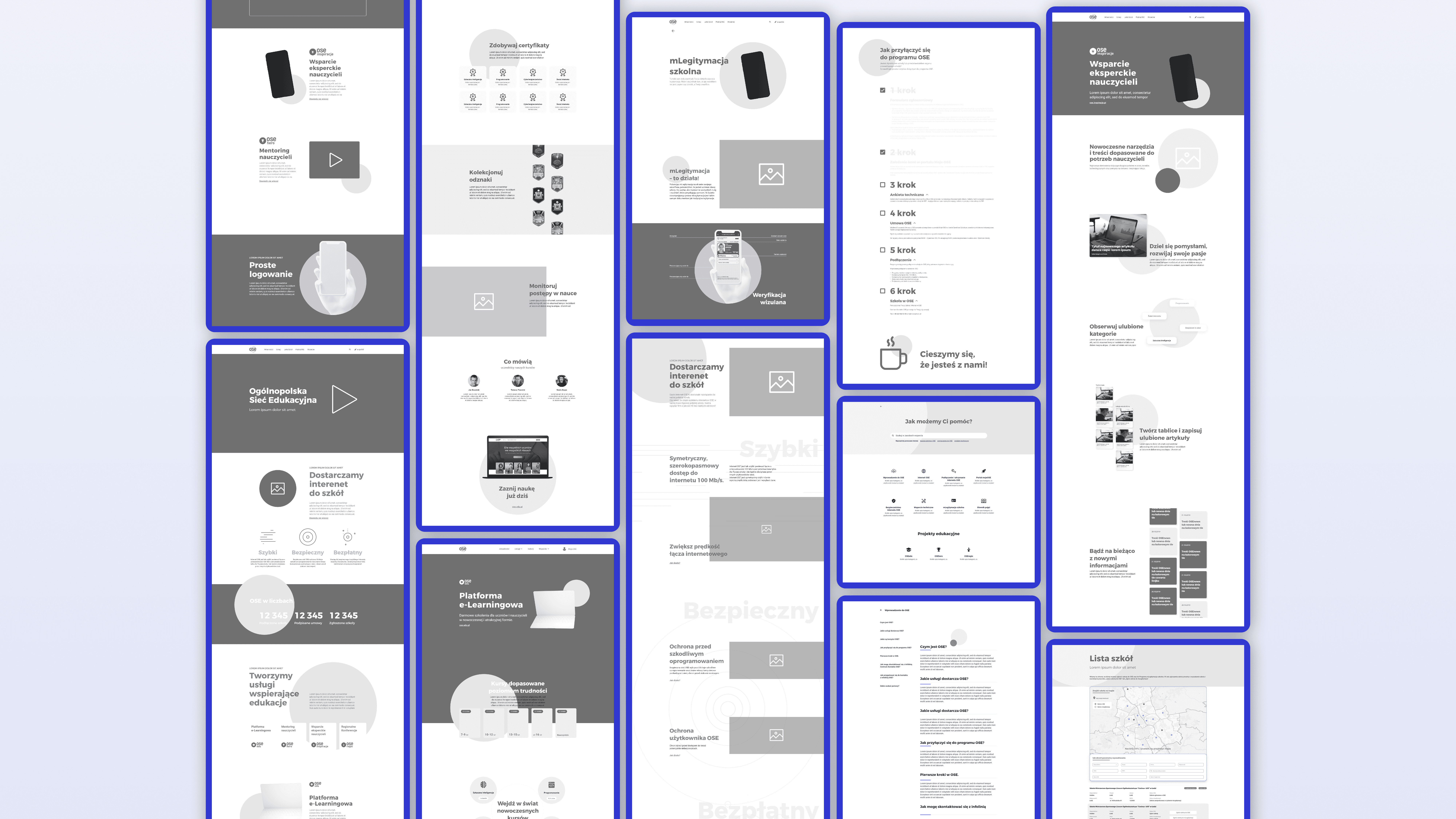

How the experience became modern and intuitive
I developed a clean, accessible interface with clear hierarchy and responsive layouts across mobile, tablet and desktop. High-fidelity prototypes helped validate the new structure. Users in testing found information faster, understood OSE’s mission more clearly and expressed overall confidence in navigating the redesigned experience.
What improved after the redesign
The new website presents OSE’s mission in a direct and user-friendly way. Visitors can now easily explore its educational initiatives, read updates in one place and solve technical problems through a structured support area. Prototype testing showed improved clarity, faster task completion and higher user satisfaction.
What this redesign accomplished
The project transformed a complex, confusing website into a focused, modern platform that finally reflects the national role of OSE. By clarifying its mission, highlighting its educational projects and simplifying its structure, the redesign allows users to quickly understand what OSE offers and how it helps schools across Poland.

